Share on Facebook
 Share on X
 Share by Email
 Share on Google Classroom
Logo
Logo, a symbol, mark or word used by a corporation or other organization to distinguish its products, services or identity from those of anyone else. First used in 1937, the term was originally an abbreviation for "logogram" or "logotype" (both derived in part from Greek logos, "word"). It came into general use in Canada among marketers and designers in the 1960s, and by the mid-1970s it had become, to the layman, a synonym for "trademark."One of the first details a new company must consider is its corporate image, reflected in the design of a symbol to be used in advertising and on packaging, vehicles and stationery. A long-established company may redesign an old trademark or adopt a new one, as CANADIAN NATIONAL RAILWAYS did in 1960. For many years CNR had used a realistic maple leaf as a frame for a dark square within which appeared "Canadian National Railways" in white, each word under the next. The designing of a new mark was entrusted to James Valkus of New York, who asked Toronto designer Allan R. Fleming to take on the assignment.
After months of work, Fleming joined the letters C and N into one continuous flowing line, to symbolize the movement of people, materials and messages across the country. The design, accepted by CN, created a national controversy. There were complaints that it looked like a "tapeworm rampant" or the numeral 3 on its back; but around the world the idea of having a simple, bold logo had come into vogue.
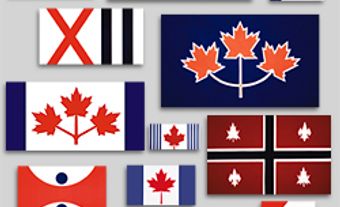
Many Canadian firms adopted new corporate symbols such as the M for the BANK OF MONTREAL, designed by Hans Kleefeld of Stewart & Morrison Ltd, who also designed the AIR CANADA symbol of a maple leaf within an open circle. Burton Kramer of Burton Kramer Associates created the animated C symbol for the CANADIAN BROADCASTING CORPORATION-Société-Radio-Canada. The Canadian Confederation Centennial symbol, a maple leaf composed of 11 equilateral triangles to represent the 10 provinces and the territories, was the work of Stuart Ash of Gottschalk & Ash Ltd, and Georges Beaupré designed the NATIONAL FILM BOARD symbol representing the eyes of mankind seeing the world.
See also GRAPHIC ART AND DESIGN.